Evaluation
 We found out that the cutaways we used within our documentary were as important as the voice-over we used, as without these the documentary wouldn’t be as interesting and people would lose interest immediately. We felt that some of the cutaways used were important as they got the audience involved with the documentary itself, in some, they felt like they were in the car driving, therefore this enabled them to feel connected with the documentary. They gave the impression that the audience were in the driver’s seat; therefore this may enable them to get more interested in doing their driving lessons.
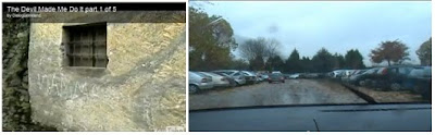 Reconstructions were also used within our documentary, to highlight different parts of driving. They gave that idea of what it’s like to drive. It also gave them the element of the first hand feel, without actually being behind the wheel of a car. It also gave that aspect of an info-tainment like feel within our documentary.
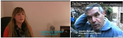 The graphics used to illustrate interviews were simple, yet informative. They told the audience who the person being interviewed was, and how they were relevant to the documentary itself. We used the colour because we did intense research before making our documentary to find out what people actually like; therefore we asked the question, what’s your favourite colour? And the majority of people said it was blue so this was clear to us that the graphics needed to be blue, to get our target audience interested.
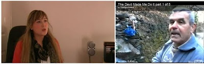 The framing of our interviews was crucial, the framing of each interview had to be consisted throughout the documentary therefore they all needed to be the same. We framed each interview 1/3 down the screen. This would then give it a more professional look as all documentaries I had previously watched were framed like this.
Underneath certain parts of the documentary, a music bed was added to keep the audience’s attention. The music we used was relevant to our documentary, all songs were about driving or cars and this was important as it kept with the theme of our documentary. We chose ‘baby you can drive my car, the Beatles’ ‘Cars, Gary Newman’ ‘Shut up and drive, Rihanna’ and ‘ jcb song, nizlopi’ we decided to use all of these songs because they would appeal to our target audience but they would also appeal to the older market too. Therefore people who were of the older generation who wanted to learn to drive could also watch this documentary. We needed to use fresh songs that people would know and by using music from an artist like Rihanna would appeal to the younger market whilst the other songs used within the documentary would again appeal the a different viewer.
Mise-en-scene of our documentary was vitally important in keeping the audience’s attention, we decided to interview a driving instructor inside his instructor car, and we did this because we wanted to give that friendly feeling about him that people don’t need to feel scared when wanting to learn to drive, because it’ll be a calm friendly atmosphere. We also used a blue screen; this enabled us to add whatever we wanted, and gave us total control, instead of just have the interview in a set place.
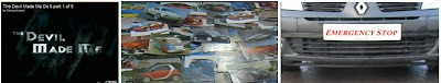 Throughout making the title sequence for the documentary, we thought of numerous things in what we could use. But eventually we decided that having a montage of cars would suit our documentary more, and this would entice the audience into watching it. The photos of cars appeared one by one to create this massive collage of cars after this a car would drive to the screen and the title ‘Emergency Stop’ would be on the licence plate. This enabled us to be different and the make a title sequence that people would remember and enjoy. Straight after the title appeared a clip of a car driving over the Runcorn Bridge; having this after our titles would keep the audience’s attention making them want to watch more. Again the music beds, underneath the titles were vitally important as this would set mood for the audience. It would then appeal not to just our target audience but to a wider audience.
 Whilst filming out documentary, we decided to film vox-pops. We did this to find out what ordinary people thought about driving and their own views on the matter. So we asked generic questions about driving to find their opinions. We learnt about many people first cars, in which we could incorporate into our documentary. We felt that vox-pops were needed to make it look more professional, these would then give that element that people could relate to because they were ordinary people.
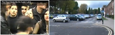
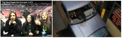 When gathering Archive footage we decided to chose something relevant, something that our target audience could in theory relate to. Therefore we decided to use clips from the show Top Gear and Final Destination 3. Both these incorporated ideas within our documentary. Top Gear enabled us to show what people were influenced by when buying or amending their cars. And final destination 3 involved a crash involving teenagers. This showed the bad sides of what driving could cause, to show that some people could be immature when driving and not focusing on their surroundings. We chose both clips, because they would create this element of info-tainment for the audience, both clips were modern and fresh in people’s minds so it made it a lot more relatable.
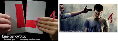 When looking at the print advert in which we made we had to look at the specific codes and conventions for these set pieces. In order to gain a valuable and professional looking product we needed to look at what actual professional products looked like, in order to gain some insight into what we needed to do. As I looked at different products I learnt that my product needed to have specific things within it. It needed a central in which the audience would notice when looking at the product, it needed to be something related to the documentary itself so we decided to use the learner plate. I found out that all print adverts I looked at all had this one central image. They all had the channel logo on it, so this was a vital part of my print advert, this enabled people to understand what the channel was on, it then also looked more professional as it had a well known logo within itself. The print advert itself didn't really challenge the codes and conventions of print adverts, it was more to do with conforming with what others looked like however it had our own touch on it, as we were able to design it our self
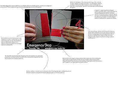
Again with the radio trailer, this didn't really challenge the original codes and conventions. We made a advert that would be catchy and what people would remember. Having this meant that people would know it was an advert, which could be played on the radio. Essentially we had to make it appeal to our target audience so that they would eventually watch the documentary after they'd heard the advert. We then used clips from the original documentary it order to link them both together and having this meant that they could relate to what the products had to offer. I ended up listening to other radio adverts in order to get some inspiration of what my documentary could consist of. All radio adverts that I listened to consisted of the time, day and channel in which the documentary would be shown on, but also the slogan that went along with it, which would essentially drawn the audience in, with its snappy and rememberable slogan.
if this doesn't work, click this link.
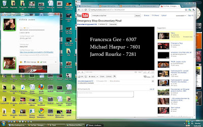
http://www.slideshare.net/harpur91/evaluation-q2-6503450
3. What have you learned from your audience feedback?
if this doesn't load, click the title about^^^^
4. How did you use media technologies in the construction and research, planning and evaluation stages?
if this doesn't load click title above ^^^^^
Audience Feedback
Looking at what people said about my documentary, radio advert and print advert I've learnt a lot of valuable information when making documentaries. And if I was to do it again, I would change a lot of things, I'd have things set out ready so the making of my documentary would run smoothly.
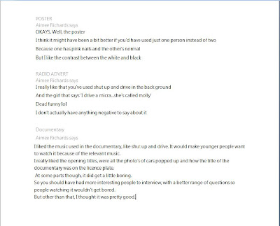
The following questions were asked in order to gain myself feedback from my target audience, these questions help me gather a clear understanding of what people thought about the 3 ancilliary texts I had produced.
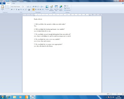
1. did you follow the narrative within our radio trailer?
2. did you think the background music was suitable?
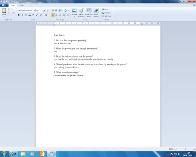
1. do you find the poster appealing?
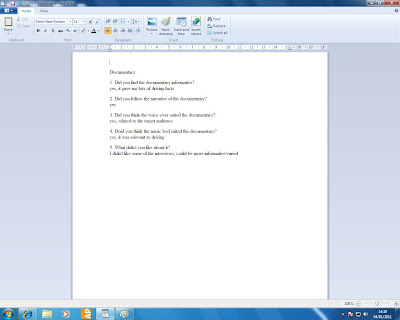
1. did you find the documentary informative?
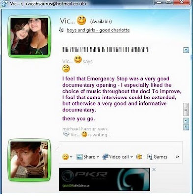
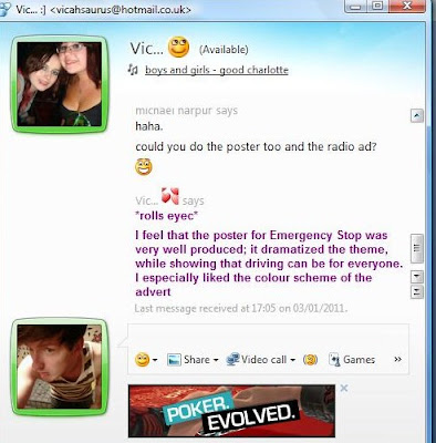
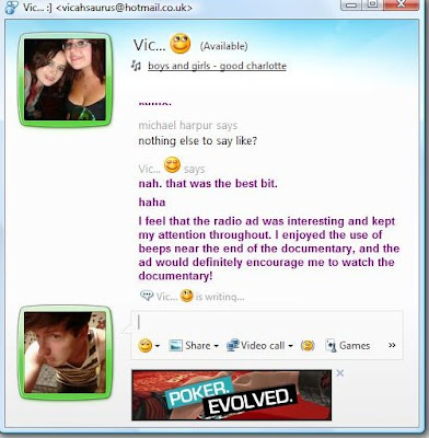
After getting the feedback, I was able to understand what I had done wrong but also what I had done good, by using these methods, I found that people were happy to give me feedback because of easy to use method of viewing. Therefore using such technologies helped me gain a non biased feedback, because people were able to comment on how they actually felt.
Newspaper Advertisement Production
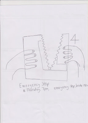
Therefore we decided to use a ripped L plate, in order to signify that this documentary was about driving, but not just about learner drivers. It had a more broader audience in which it could appeal too. Even though our main focus was for teenagers, we thought that it would be suitable for all ages who may be learning to drive. Thus making this poster as broad as we could, might attract not only young drivers but anyone person who is in process of learning to drive.
First of all, creating a layer for the poster was the first main thing we needed to do, we placed white background as a simple start, copied our focus picture onto this background and cut it out so all that you could see were a pair of hands and the ripped L plate. We decided to do this because we didn't want the background of the photo to distract our audiences attention.
 After this, we decided to play about with the background changing it to black, and increasing the size of our main photo. We also had a little play about with text, to see what our poster could actually look like.
 At this point, we had played around with our print advert, but this wasn't finished here, we also had to add the Channel 4 logo onto our documentary, to show what channel this would be broadcast on, and the time and date was also an important part of our print advert. As it would enable people to tune in, if they wanted to watch this documentary.
In making this final practice poster, we had to make sure each layer was in a specific place in order for the poster to turn out the way we wanted, and that we didn't want things to be out of place this would then start to make the poster unprofessional and we didn't want that.

After clear discussion, we finally decided on a slogan and a specific colour scheme to make our poster look more official. We moved the title and date and time to the bottom left hand side, but we also moved our slogan next to it. This enabled us to produced an official like poster for our docmentary.

Drafting Newspaper Advertisement